Sidecar is a B2B digital marketing solution for retailers. Sidecar provides its customers with a blend of technology and retail experts to manage campaigns across multiple e-commerce networks. These networks include Google Shopping, Google Paid Search, Bing Shopping, Bing Paid Search, Amazon Ads, and Facebook Ads.
What is Sidecar Connect?
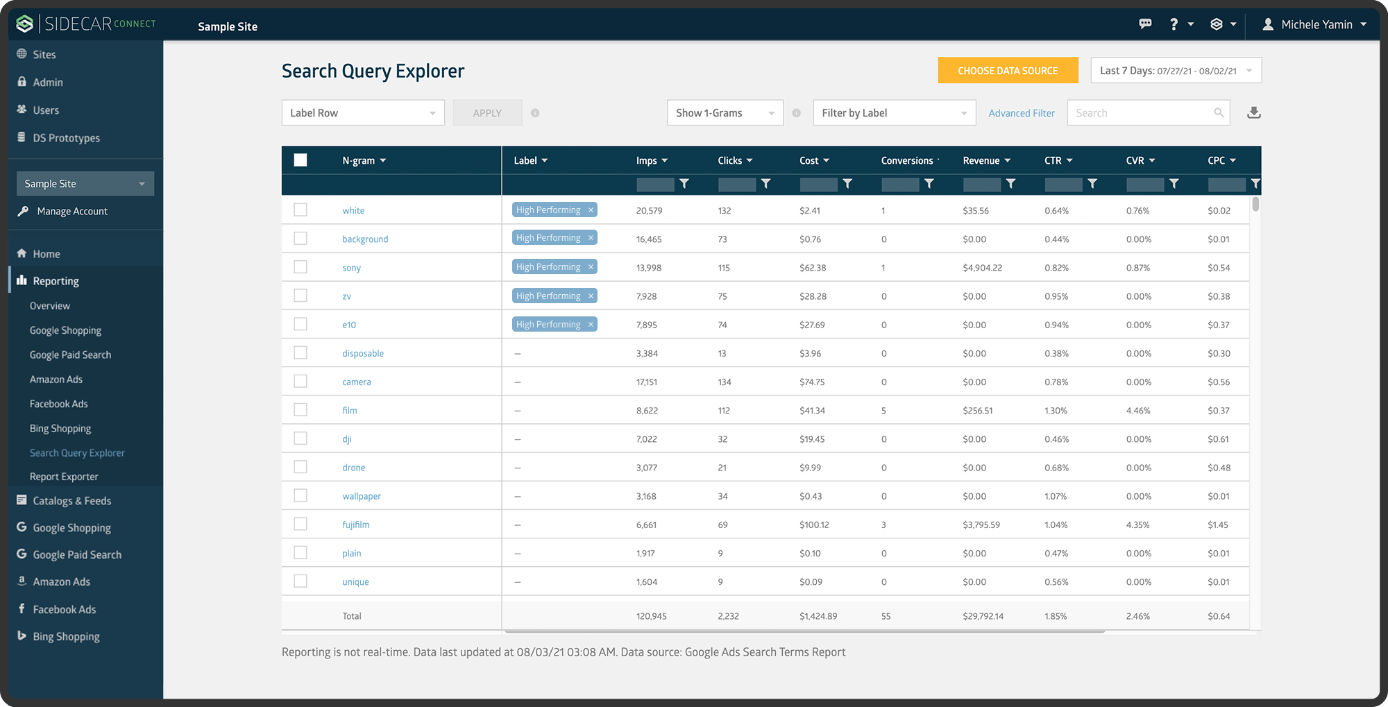
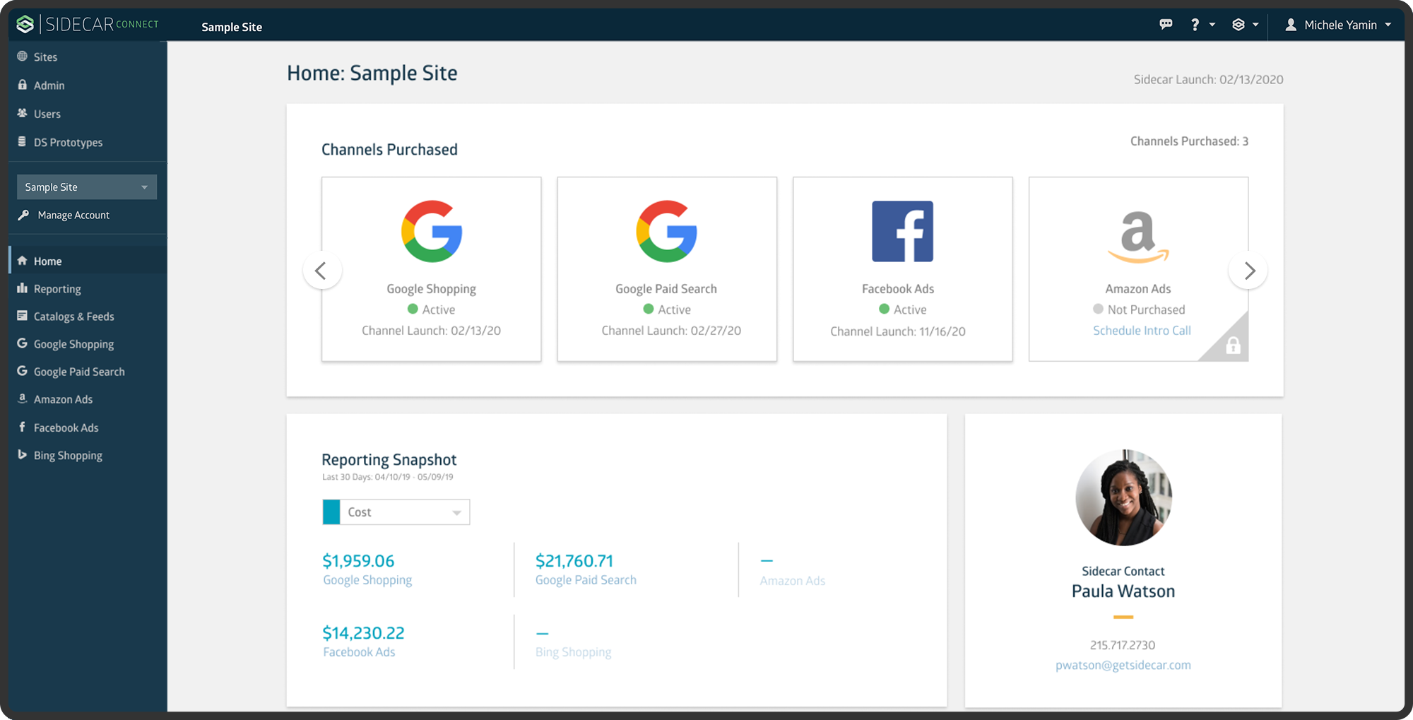
Sidecar Connect is an interface built for both Sidecar employees and Sidecar customers. For Sidecar employees, Connect is a centralized place to manage technology for customer accounts. For Sidecar customers, Connect is a reporting dashboard to view marketing channel performance.
Process
The problem
A growing need for a multi-channel focused navigation.
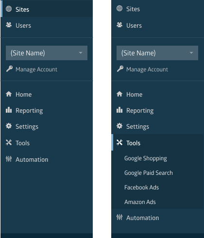
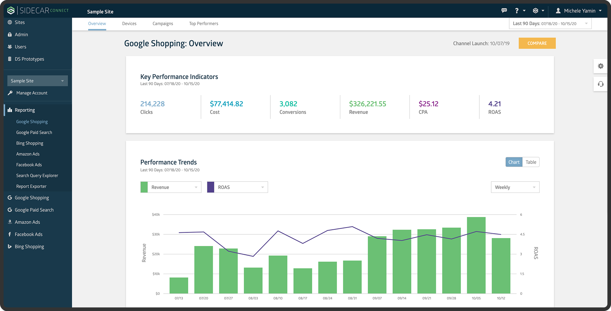
Sidecar Connect was originally built when Sidecar’s only product offering was one marketing channel, Google Shopping. At the time, there was a clear distinction between manual tools, and automated technology for the channel. The modules, sections, and pages of the application were all structured around this concept.
As the company began to build more complex tooling and tech, the line between manual tools and automated technology began to blur. The addition of other channels being added to the platform added to this issue, and it became increasingly confusing for end users to understand where certain features were nested within the structure.
After receiving feedback from our internal users about the confusion, and struggling to determine where new features would fit, I brought the problem up to the product managers. Together we decided it was time to rethink the navigation for a multi-channel platform.
The Research
Understanding the current and future state of the channels.
The difficulty of restructuring the navigation came from the unknowns of the new channel strategies. Each was being worked on independently with a different product manager, a different engineering team, and different end users.
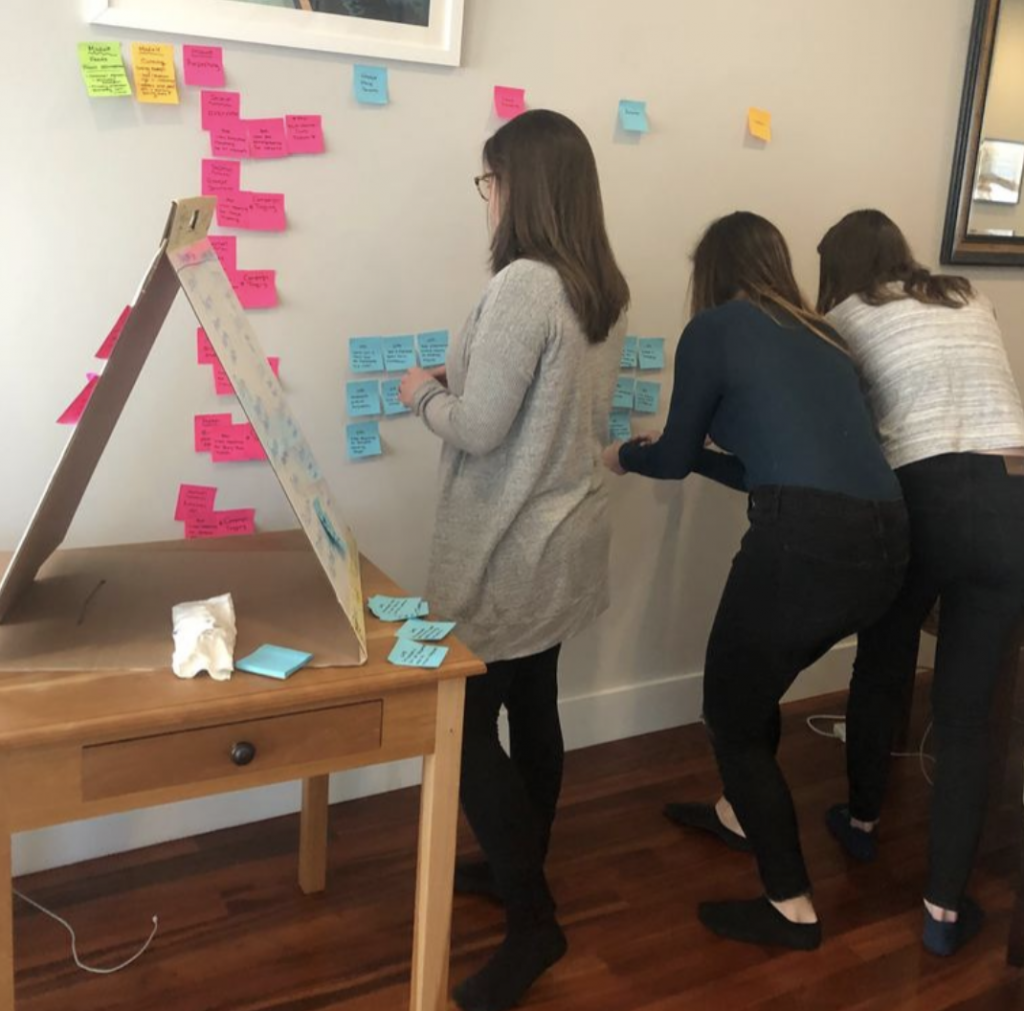
As a first step of understanding the multi-channel strategy, I conducted a card sort with the product managers. They were each responsible for writing out the different tasks an end user would need to complete in order to manage their specific channel. Once we had all the tasks written down on sticky notes, we began to look for the similarities and differences between channels. We then took those stickies and structured them into groupings and named those groupings. This gave us the very beginning of a navigation structure. The process took about 7 hours, and once we were finished we felt confident we had something to test.
The Approach
Putting on our navigation to the test.
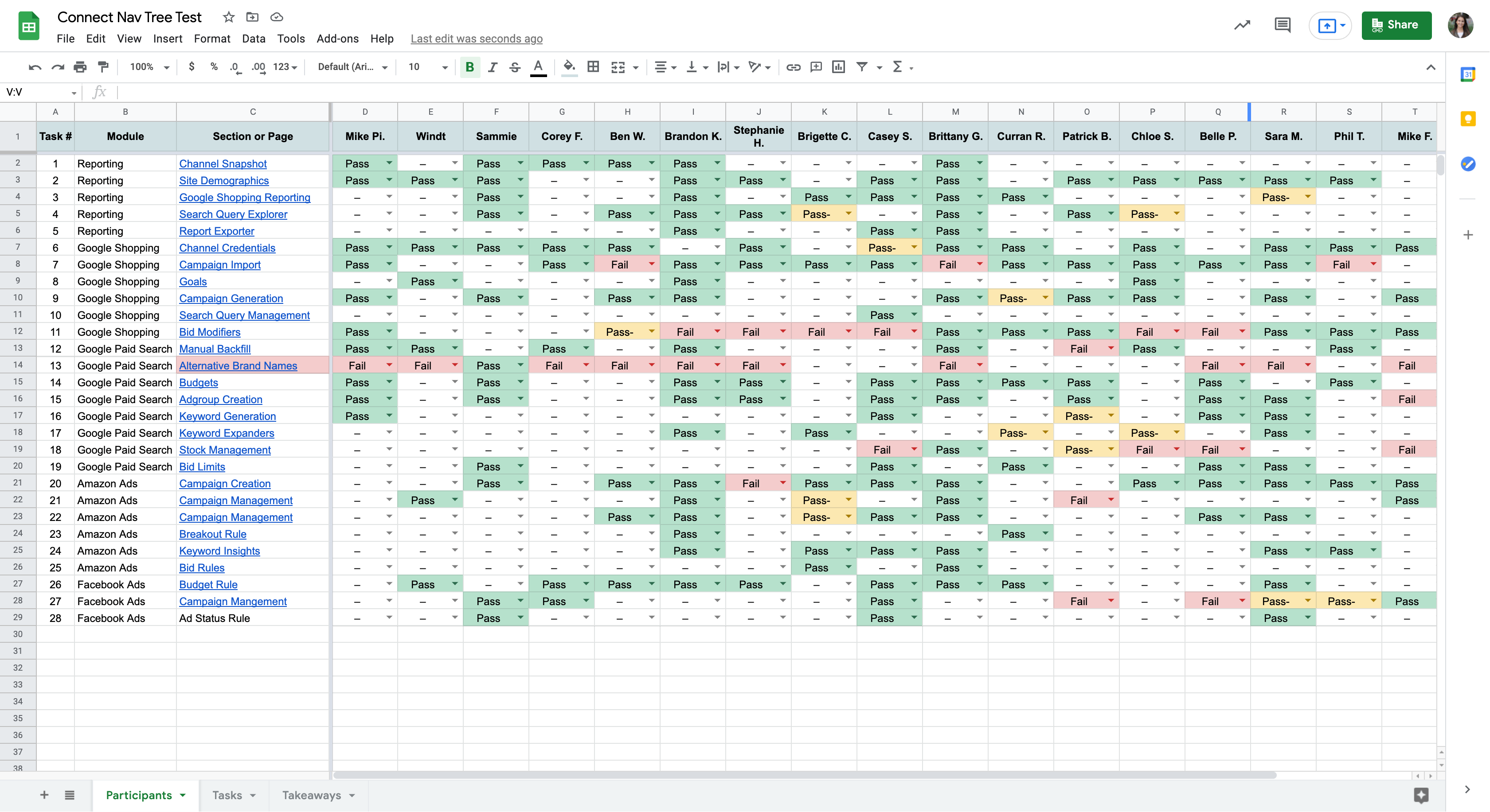
Now that we had an idea for the restructure, we needed to test and prove our concept. I created a tree test that would allow us to see if users could navigate through the platform correctly. I wrote out 27 tasks that a user would need to complete within the application. I created a low fidelity html navigation and read one task at a time to the participants. They would then click through the nav and explain their process through each click. If the user was able to find the correct page it was marked as a green pass and if they landed on an incorrect page it was marked as a red fail. If there were moments where the participant was not confident about their decision it was marked as a yellow pass. I conducted this activity with 18 participants with various levels of experience.
The findings:
Most users were able to successfully navigate to the correct pages
Users were able to navigate to pages that were not part of channels they managed or were familiar with
One of our pages failed almost unanimously across all participants, so we took that feedback and moved it to a different section
The result
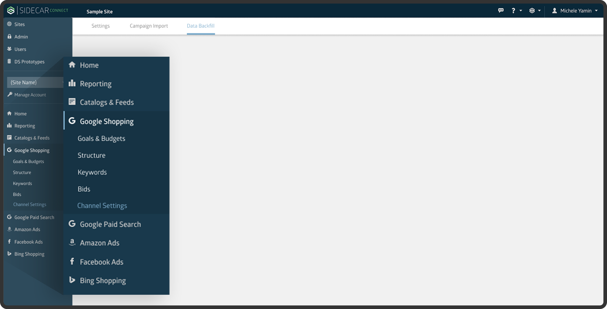
An intuitive, cross-channel navigation
Once released, we received a lot of positive feedback from our internal team on the new structure. Some general feedback we heard from users:
Easier to navigate
Allows the user to focus on one channel at a time without having to jump around the app
A clear distinction between the different sections